When Your Debate Opponents Argue Your Point
While researching arguments for and against the National Popular Vote, I ran across the site Keep Our 50 States, which tries to argue for keeping the Electoral College, and, um, it doesn’t do a very good job of it.
For instance, the “The Issue” page shows this Mike Lester cartoon:
I’m not sure what this is supposed to convey. That California’s 55 Electoral Votes are neatly balanced by… New York’s 29? Is it because they’re both reliably-Democratic states? So shouldn’t Texas be in there as well? Or are it and Florida lumped in with the “flyover states”? This is very confusing.
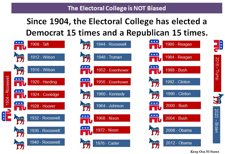
Speaking of confusing graphics, the same page has this chart:

At first blush, this appears to be the worst argument ever devised for the Electoral College. Saying “the Electoral College is fair because it elects equal numbers of Republicans and Democrats” is like saying “this judge is fair because he convicts half of the defendants who come before him, and acquits half”. You can’t know whether the judge is fair until you know how many of his defendants are actually guilty (maybe 90% are, and he lets a lot of guilty people go free; or maybe only 10% are, and he wrongly convicts a lot of people who come before him. Likewise, we can’t judge whether the Electoral College is fair until we know what the outcome of an election is “supposed” to be.
And, of course, that goes to the heart of the matter. In a democracy, we’re used to the winner of the popular vote winning the election. That’s how it works for governors, senators, mayors, and pretty much every post except president. So the argument above is remarkably wrong.
But beyond that, what amazes me is this: the person who designed the graphic had one job: fit thirty data points into three columns. But apparently this Einstein divided 30 by 10, somehow got 9, and then tried to shoehorn the remaining three entries on the sides.
I’m open to debate, and I don’t mind having my mind changed. But please, try to do better than this.

